Here's two things I did recently. The Robits, they may need a bit more time. not enoughlikeness. Also might add Gandalf.
Showing posts with label digital paintings. Show all posts
Monday, October 1, 2012
Wake up & Smell the Robots
Here's two things I did recently. The Robits, they may need a bit more time. not enoughlikeness. Also might add Gandalf.
Thursday, September 13, 2012
School Supplies
A group of school supplies that inspired my "Treasure Hunter" piece. This was for a project sophomore year that was more about generating concepts to see how far we could run with a theme for it's marketability. The teacher liked it but it was pointed out by several classmates that a pencil sharpener that involves you sticking a pencil up a nose may not be the best thing for young kids. They're probably right!
Magazine
A cover for a magazine highlighting an article all about movies by the Coen brothers. The design is based off of the rug from Big Lebowski. This is a work in progress.
Wednesday, September 12, 2012
The Red Bandana
Based off a 9/11 story about a man who wore a red bandana and saved lives while giving his own. needs some revisions.
Matilda
Tuesday, September 11, 2012
Monday, September 10, 2012
B-Movie Poster
Poster for Terror of the Satanic Amazon Aliens (fictional B-movie) starring Cathrine Zeta-Jones. WIP
Authors
CLIVE BARKER
SUZANNE COLLINS
NEIL GAIMAN
TERRY PRATCHET
J.K. ROWLING

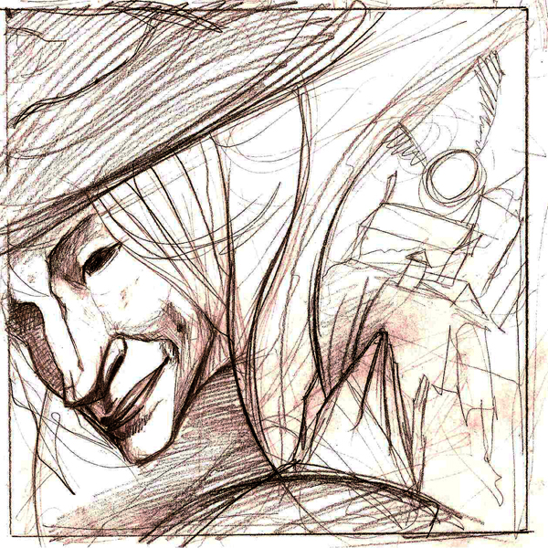
ok, so this is a big post. Basically, I wanted to do a couple portraits of some contemporary fantasy authors. They aren't finished, but it's also my first attempt to color entirely in photoshop ( half of the project was done with a friggin mouse.... don't ask why. sometimes I like to torture myself). I didn't end up doing the Susan Collins portrait, because I got too many comments that it was similar to the cover of "Secret of Kells" and "Lord of the Flies' and because it just didn't fit into the compositions of the others. Each Portrait is done in a complimentary color scheme because I thought it would be fun to try to define the mood of an author's work with simple color schemes.
They need a lot of work still, but I'll be getting photoshop for my tablet soon, so I should be able to noodle these out with a good day or two of work. I might still play with the colors and compositions more, Rowling is a bit too bubble gummy, Pratchett reads a bit gray, Barker too christmassy, and Gaimen could use some more contrast.
Subscribe to:
Posts (Atom)


